
Why Feel-Good Photos Fail: |
||
|
By Lisa Sargent
More |
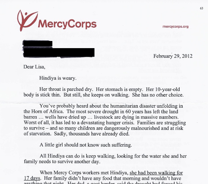
Note: ================= Among U.S. nonprofits, the overwhelming trend for years now has been to use what I call "Feel-Good Photos." Happy, healthy kids. Fat, fluffy puppies. Trust me, I've seen puh-lenty. In my office is something called The Vault: four banker's boxes of direct mail appeals and an 8,000-plus email Inbox of fundraising appeals for every reason and season. (Like Jeff Brooks and Uncle Maynard's Treasure Trove.) But happy images can send the wrong message. As studies and science prove (see Jeff B. again and Stanford's Center for Social Innovation), a phenomenon known as "emotional contagion" makes sad images more effective at stirring donor sympathy. The upshot is this: you can "catch" someone else's feelings through a photograph. A sad face -- that is, a face that shows there is a need -- kindles the kinds of emotions in people that moves them to give. The Stanford article goes on to say more about the study on which it reported -- making some important qualifications about how much sadness to show (such as sadder is not necessarily better because it can make people feel powerless to help). And as Jeff rightly pointed out, "there is a lot more information in a sad/neutral/happy expression. There are sad faces that make people feel defensive. There are happy faces that go straight to the heart...I'm showing you this because it backs up what every experienced fundraiser already knows: Sad faces get more response." Now that you know this little secret, let’s open The Vault and look at two appeals – from MercyCorps and Unicef. We start with MercyCorps. This fundraising appeal for their monthly partnership program arrived in a Monarch-sized outer envelope with "RSVP" as a teaser. Inside was this letter:
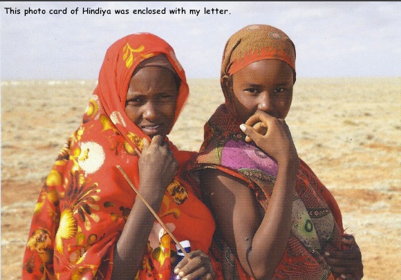
Accompanying the above appeal was the following photo card.
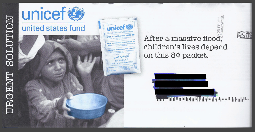
I flipped the photo card over. Was one of these girls really Hindiya, from the letter? Yes. Was it taken a long time after her 17-day journey through the desert, with virtually no food or water? It didn’t say. What, I wondered, did she look like the day her odyssey ended? There was no picture. Do you see how, for the average donor, “All Better Now” photos like these accomplish the exact opposite of what the appeal aims to do? Not to be flippant, but the problem described in the letter just doesn’t look so awful now – because through a well-meaning yet incorrect use of photos they have minimized it, in my eyes. Let’s look now at the outer envelope of a Unicef appeal I recently received. Can you see how, before I even open the envelope, it’s obvious there is a heartbreaking and urgent problem?
Inside, the hardworking Unicef appeal continues to do its job... Within the letter they directly embed an image of a baby with wide, listless eyes, being fed in someone’s arms. I am not made to feel alright. Instead I am introduced to Unicef’s solution, and instinctively feel my help is needed – right now – so another child won't die. So another mom won't have to endure the agony of holding her baby as he draws his final breath. Look, we all know that photos need captions (in donor newsletters, this is mandatory). That people-pictures are more powerful than images of things. That eyes are more effective in images than, say, the back of someone’s head. Other powerful images in fundraising appeals can be found on SOFII: the Amnesty Int'l pen pack (graphic image: warning) and Feed the Children's Baby Box. That's for starters; SOFII of course has more. But the recent feel-good photo flotilla makes me wonder if nonprofits have lost faith that the work they are doing is urgent, lifesaving, and often, “un-pretty.” And by watching what everyone else is doing, they begin to fear their donors can’t handle the truth. They can. The moral of the story is this: If you want your images to work as hard as your words, first of all, they must work together. (Hindiya’s story flew in the face of her image.) Second, at least for people images, they should show that a problem exists. Then third, either via words, images or both, you can introduce the solution ... a way for the donor to alleviate suffering or solve that urgent problem. Look back at the Unicef envelope and see how the photo shows BOTH problem and solution. To that I, and the latest science, say "Well done." Afterword: the studies referenced above relate to images of people... children in particular. I haven’t yet found a study that focuses on animals or other causes. Here is what I do know: one of the most famous animal welfare appeals of all time (at least it was back then) and a longstanding control was the ASPCA’s “Astro the Dog.” It featured a grainy, black-and-white “before” photo of Astro, ribs jutting out, eyes imploring the donor to help solve his problem. Running contrary to that is Best Friends Animal Society’s incredible success by showing only happy, healthy “after” animals – AND in its letters, dwelling less on the abuse and more on the happily ever after. Until a definitive study comes out, the best thing, as always, is to test for yourself. More | |
|
| To subscribe FREE to The Loyalty Letter monthly e-news, click here. | ||
About Lisa Sargent and Sargent Communications: Lisa Sargent is a freelance copywriter who specializes in fundraising and donor development communications for direct mail and e-mail. As head of Sargent Communications, she works almost exclusively with the nonprofit industry – often directly with organizations that use in-house and remote/outsourced creative teams. Past and present clients include Best Friends Animal Society, Shriners Hospitals for Children, Alley Cat Allies, Bryant University, Kids In Distress, Northwestern Memorial Foundation and Merchants Quay Ireland, among others. A member of the DMFA, Sargent’s articles have been featured in Mal Warwick’s Newsletter, FundRaising Success Magazine and The Agitator, and her copywriting clinic on donor thank-you letters is one of the most visited exhibits on SOFII, the Showcase of Fundraising Innovation and Inspiration. Sargent also publishes The Loyalty Letter, a free monthly e-mail newsletter for nonprofit and charitable organizations, which is read by subscribers all over the world. To learn more about hiring Lisa for on-call or on-retainer fundraising copywriting and donor communications projects, please call +001 (860) 881-7009 to get started, or email Lisa. |
||
PO Box 814, Wolfeboro, NH 03894
Voice: +001 (860) 881-7009